The Orange spread in Aromas in Coffee places a clear glass citrus juicer among orange halves, wedges and curled peel. On the facing page, a flat orange field carries the name in large white lettering. One side names the subject; the other supplies the materials. Pulp, peel, juice and hard shadows give the page something to examine when its subject is a smell.
Aromas in Coffee is a bilingual book by Junia Kim and Joseph Charles Epstein, with art direction by Ryan Romanes, lettering by Pragun Agarwal and editing by Karsten Strauss. It presents familiar aroma references through English and Korean text, lettering and still-life photographs. The book introduces itself as a scratch-and-sniff format. These digital spreads show its visual structure; they cannot reproduce the scent.
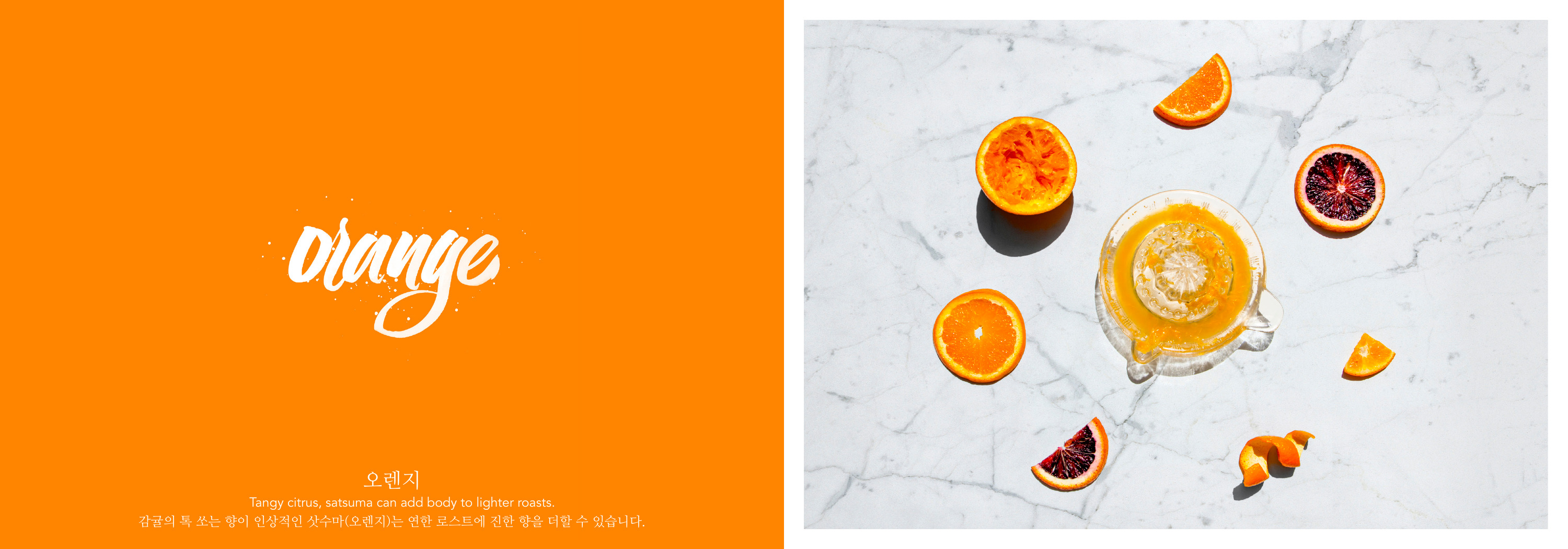
A page about an invisible subject needs a point of reference. Here, the large word supplies a category, the short text places it in a coffee context, and the photograph supplies recognizable objects. The picture does not have to illustrate every word of the description. Its job within the spread is specific enough: it shows what the named reference looks like in several forms.
The orange appears as cut fruit and curled peel within the same composition. That variation matters to the image. A whole fruit would give us its outer shape and color. Cut halves expose the pulp; curls of peel give the surface an edge and a different scale. The glass juicer introduces a tool associated with the fruit. These are observable differences in form, without needing a claim about which part produces a particular aroma compound.
The facing pages also have different kinds of space. The left page holds the title and text against an uninterrupted color. The right is full of surfaces, objects and shadows. The clean field leaves room around the lettering while the photograph carries the detail. If both pages had the density of the still life, the short descriptions would have to compete with many more edges.
English and Korean occupy the same recurring part of the text page. The English title is the largest element, with a smaller Korean label and the two descriptions below. That hierarchy is visible, and worth describing precisely. Two languages are present, but presence alone does not establish equal emphasis or equal ease of reading. Reviewing a bilingual layout means looking at the size, position and space given to each language as well as checking the words.
The repeated arrangement gives the series a stable structure. A change of aroma can bring a different palette, lettering shape and collection of objects, while the title and language blocks retain their places. Floral makes that change particularly clear.
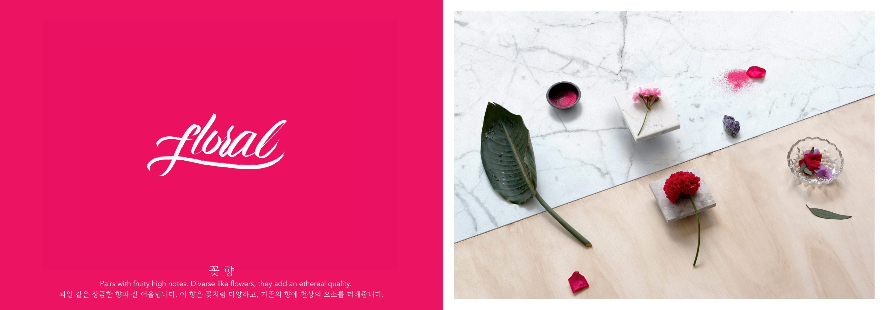
Orange names a particular fruit. Floral names a broader family of references. Its photograph includes different flowers, petals and leaves arranged among pale surfaces. Pink moves between the solid page, flowers and scattered material, tying the two halves together. The category has changed in breadth, and the photograph has changed with it.
This difference is useful when choosing imagery for a series. A single familiar object can carry a narrow subject. A broader subject may need a small collection whose parts belong together. Choosing the same kind of photograph for every entry can conceal that distinction. Before styling a scene, decide how specific the subject is and which visible objects can represent it without requiring a long explanation.
Cinnamon introduces another variation. Its sticks and powder show two forms of the named material. The photograph brings in a wooden spoon, a mesh strainer and a mortar and pestle. Brown and pink surfaces meet diagonally behind them. The image has more directional movement than the flat title page, but the two colors still connect it to the lettering and background opposite.
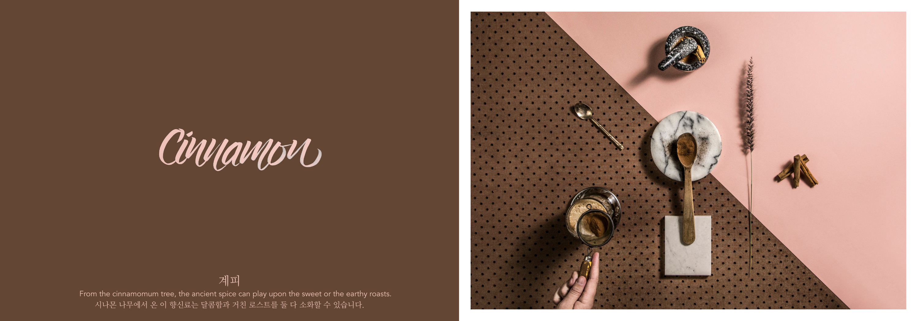
A series benefits from deciding which parts repeat before deciding how each entry will vary. In these spreads, the position of the text provides continuity. The photographs can then change their objects, surfaces and direction. For a new book, a practical first review would place three quite different subjects side by side. Check whether the text can stay in a consistent place, whether each image represents its own subject clearly, and whether the differences survive at the size of the finished page.
Review the language blocks separately from the image. Check both with a qualified reader of that language, including any short labels that can be easy to overlook beside a large decorative title. A visual comparison can identify an imbalance in size or spacing. It cannot establish that a translation is accurate. Those are different checks, and a finished layout needs both.
The format of the review matters too. A full spread preserves the relationship between its pages, but its small text becomes difficult to read on a phone. Here, each image opens at a larger size, and the surrounding text describes the relevant features in ordinary HTML. The complete artwork remains available while the article carries its own explanation. The Aromas in Coffee project brings these spreads into the wider body of work.