TL;DR
- Keep the same visual language across the scenery, instructions and controls.
- Give actions a clear place on screen, even when the scene is full of illustrated detail.
- Check the interface during play and at phone size; a good-looking screenshot alone cannot prove usability.
A game can have a beautifully illustrated room and still feel disjointed when its controls appear. The menu may look as if it belongs to a different product. SWOLE offers a useful visual example of another approach: the room, the activity buttons and the on-screen instructions share the look of a printed comic.
This is a close reading of the already-public SWOLE game page and its published gameplay capture. SWOLE follows a 97-pound weakling through a 1960s comic-book world toward a beach strongman championship. Its five daily activity slots put exercise alongside work, meals, rest and friendships. The observations here concern the visible interface, rather than how the game is implemented.
Let the room explain the choices
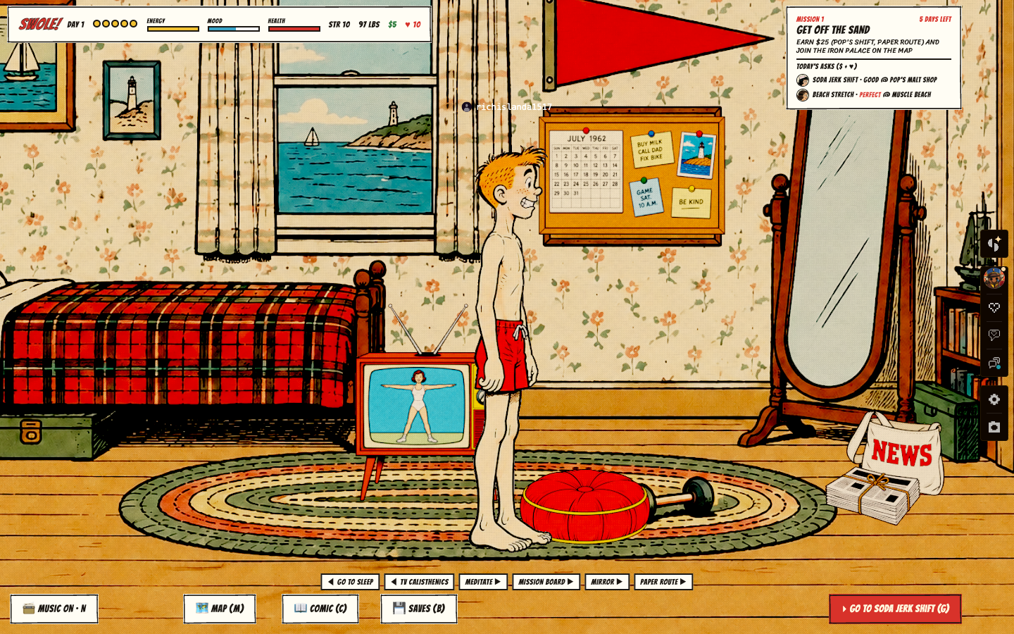
The bedroom contains a television, a mirror, a calendar, a noticeboard and a newspaper bag. Those objects give the player a setting before any instruction is read. The buttons below the scene name concrete activities: sleep, television calisthenics, meditation, the mission board, the mirror and a paper route. A prominent button points toward the soda-jerk shift.
This is useful because the objects and labels reinforce each other. A player who has noticed the television has a visual reference for the exercise option. The noticeboard provides a plausible home for plans. The room gives these choices a context; the labels make the actions explicit. An object does not have to carry the whole burden of explaining what a click will do.
Keep instructions separate from decoration
The wallpaper, patterned rug, posters and furnishings fill the room with detail. The status strip remains in a light rectangular band at the top, while the mission sits in another light panel at the upper right. Dark lettering and simple borders separate those reading surfaces from the illustration. The scene can stay busy without forcing every word to compete with the wallpaper.
For a game with a strong art style, this is a practical distinction. A control can use the same lettering and inked outlines as the setting while retaining a plain reading surface. Test whether the player can find the next action quickly. If they must inspect every ornament to distinguish a button from a prop, the illustration is doing more work than the interface can support.
Carry the style into the minigame
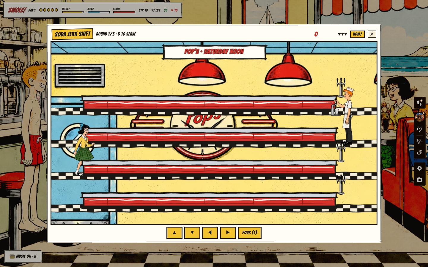
At Pop’s Malt Shop, the serving screen appears as a framed panel over the location. Its title and round information sit above the play area; movement buttons and a pour control sit below. The lanes take up most of the panel. That arrangement lets the scene introduce another kind of action without also introducing an unrelated visual identity.
The surrounding location remains visible behind the panel. It keeps the activity connected to the place where it occurs. At the same time, the strong frame tells the player which area now needs attention. This is a useful test for any illustrated game with several activities: can the presentation make a change of task clear while preserving the sense of being in the same world?
Review the moving screen
A still can show composition, but it cannot establish how a control feels in use. Watch the moving capture for the moments when attention shifts between the scene, the status information and the next action. Then try the game itself. Look for labels that become difficult to read, actions that are easy to overlook, and panels that obscure the thing the player needs to follow.
At phone size, inspect the same relationships again. The published desktop capture is an example to study, not proof that every control is already comfortable on a small screen. Readable lettering, enough space to tap and an unobstructed play area each need their own check. Keeping the comic-book identity is worthwhile only if the player can still understand what to do.
See SWOLE’s trailer, comic pages and game. For another example of connecting a game’s presentation to its objective, read the Lemmings visual study.